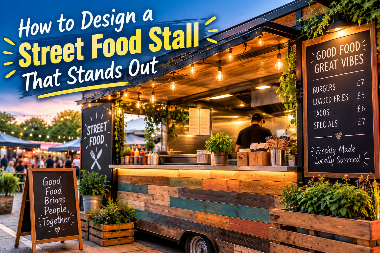
Go to any street food market and you'll see the same thing repeated fifty times over. White pop-up gazebo, handwritten chalkboard menu, maybe some fairy lights if they're feeling fancy. None of that is bad on its own. But when every single stall copies the same setup, nobody stands out, and customers are making snap decisions about where to eat based almost entirely on what grabs their attention first.
Design pulls a lot of weight here, more than most traders give it credit for. Let's talk about colour choices, signage details, layout tricks, and the stuff that turns a forgettable pitch into a stall people actually photograph and share online.
Pick a Colour Palette and Commit to It
New food traders almost always make the same mistake. They don't pick a colour palette. What happens instead is they cobble together whatever was cheapest or closest to hand: a green gazebo here, a red tablecloth there, a blue cool box shoved under the counter. The whole thing looks thrown together, and customers notice that, even if they couldn't tell you exactly what's off about it.
Two or three colours will do the job. Carry them through everything, from your canopy and signage to your packaging, your aprons, even the tape holding your setup together. That kind of visual consistency is what makes one stall look like a brand and another look like a car boot sale.
Bold, saturated tones tend to do best outdoors. They hold up against natural light and busy backgrounds. Deep mustard, forest green, burnt orange, navy. Pastels can work if you want them to, but you'll need sharper contrast in your signage or everything will look washed out the moment the clouds roll in.
Your Canopy Does More Than Keep the Rain Off
Most traders treat their gazebo as purely functional. Fair enough. But it's also the single largest visual element of the whole stall, and customers will clock it from 20 metres away, long before they can read your menu or get a whiff of whatever you're cooking.
Traders who go for custom-printed gazebos for street food businesses tend to look established from day one, even at their very first market. A canopy with your logo, brand colours and maybe your signature dish printed across it creates recognition from the far end of the row and makes the whole setup look intentional, not improvised.
Think about what you'll be placed next to when you're choosing your canopy colour. At most markets, the majority of stalls will be white or grey. A rich, saturated canopy in your brand colour will pop against that wall of neutral tones without much effort on your part at all.
Typography on Menus and Signage
Your menu board has to do two things at once. It needs to be readable from a short queue distance, and it needs to match your brand's personality. A rustic sourdough pizza stall and a Korean fried chicken stall shouldn't look the same on the menu, because they're telling completely different stories about what kind of food you're about to eat.
Keep it to two fonts. One bold typeface for dish names, one clean and simple font for descriptions and prices. Go beyond that and things start to look messy. Make your prices big enough that nobody has to squint or lean in to read them. Nothing kills a queue faster than customers who can't work out what things cost.
Chalkboard users, do yourselves a favour and invest in liquid chalk pens. The lines come out cleaner, the text won't smudge when it's damp outside, and you can still wipe it all down and update between events.
Visual Merchandising at a Three-Metre Pitch
You don't have a shop window. What you do have is a counter, a serving hatch, and whatever vertical space your gazebo walls give you, so use all of it.
Stack branded packaging where customers can actually see it. If you sell sauces or dry goods alongside your main menu, line them up neatly at one end of the counter instead of hiding them in a box underneath. Put a few finished dishes at eye level whenever you can, because people eat with their eyes first and that goes double at food markets where everyone is browsing.
Props can help, but only when they're relevant. A coffee stall with a few hessian sacks of beans stacked behind the counter tells a story about where the product comes from. A burger van with a random potted plant sitting on the counter tells no story at all. Everything visible should either do a job or reinforce who you are as a brand.
The Stall That Gets Photographed Wins Twice
A stall that looks good doesn't just pull in foot traffic on the day. It generates content for free. Customers who snap a photo of your setup and post it online are handing you marketing that reaches people who weren't even there.
So think about what your stall looks like through a phone camera. Is there a clear focal point? Can someone frame a photo that captures your branding and your food in one shot? Small details like branded greaseproof paper, a neon sign with your name, or a distinctive serving style can be the difference between a stall that gets shared and one that gets walked past.
Where Good Design Meets Repeat Customers
Street food is crowded. Really crowded. And the traders who build a following fast are almost always the ones who've put as much thought into their design as they have into their recipes.
You don't need a massive budget for this. You need a clear colour palette, consistent branding across every touchpoint, and the willingness to treat your stall as a visual experience. Get those things right and you won't just stand out at one market. You'll be the stall people actively look for at the next one.